
01/ Overview
Shoshin Tech is an EdTech company that aims to empower individuals through products that foster personal well-being and skill development.
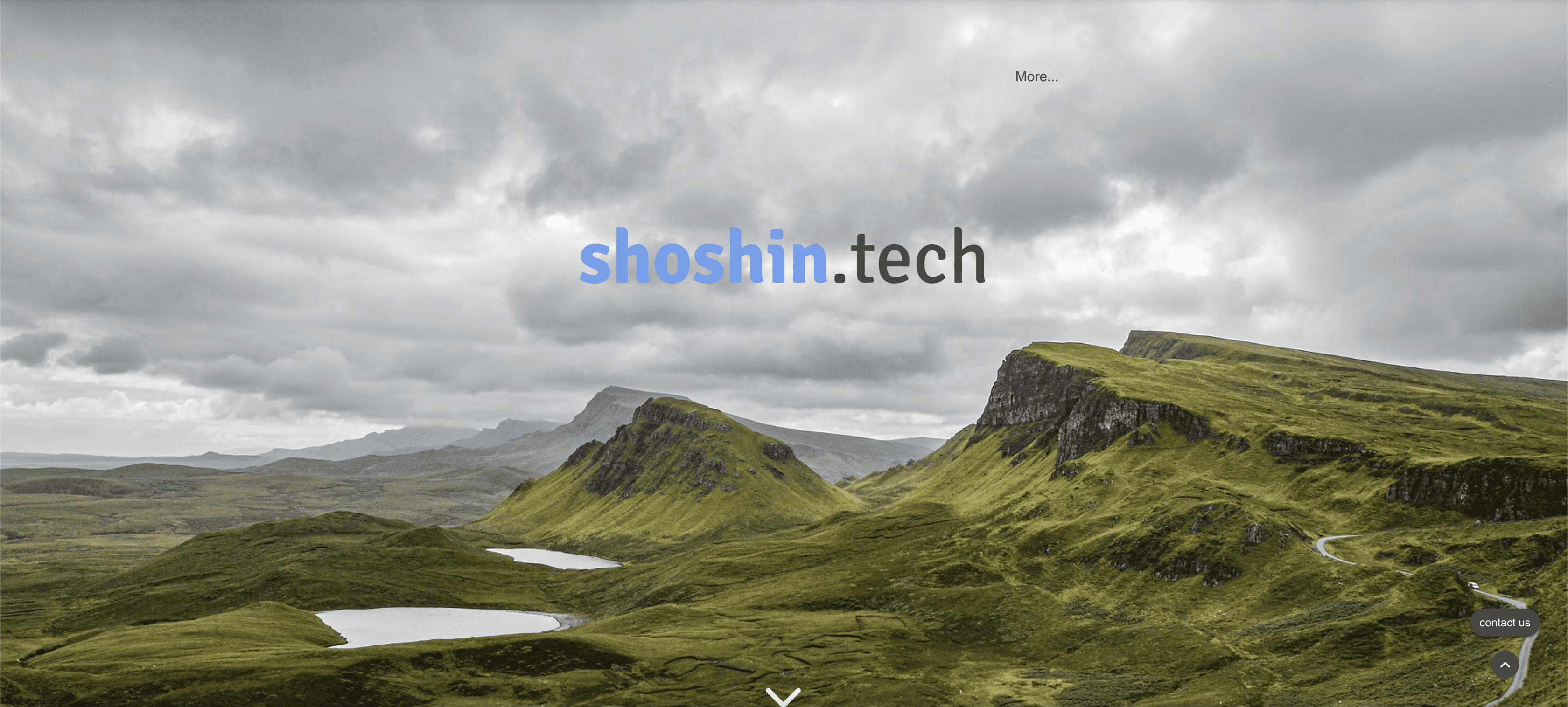
When I first heard about Shoshin Tech, I tried to look it up before my interview and I hit a wall. I couldn’t find the website easily. And when I finally did, it gave a very different impression of the company than what I was later given during the interview.
The vision was warm, human, and introspective.
The website looked generic, fragmented, and distant.
02/ Spotting the gap
After joining Shoshin Tech, I brought up my experience as a candidate who struggled to find and understand the company through its website.
I proposed a complete redesign of the website—one that would:
Reflect our focus on the values and vision of the company
Tell a clear story about the culture
Make it easier for candidates and visitors to find and understand us
Strengthen our visibility on Google
I took ownership of the redesign, leading the UX and UI, while collaborating with the tech lead and a marketing intern.
03/ The solution
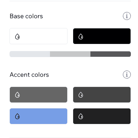
To support the vision of calm, trust, warmth and curiosity, I:
Defined a color palette that conveyed the same to replace the heaviness of the existing palette.
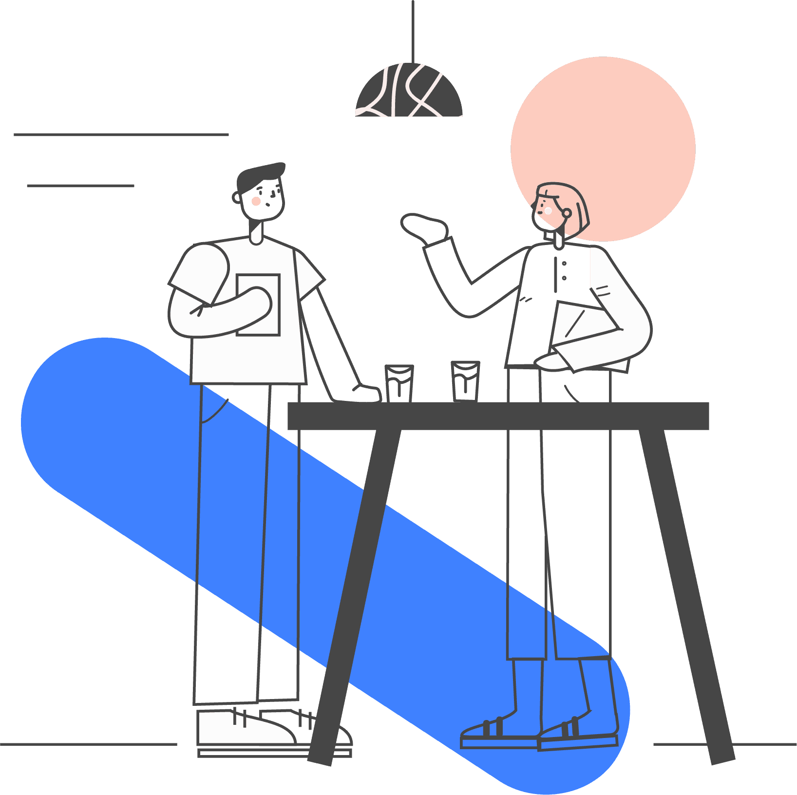
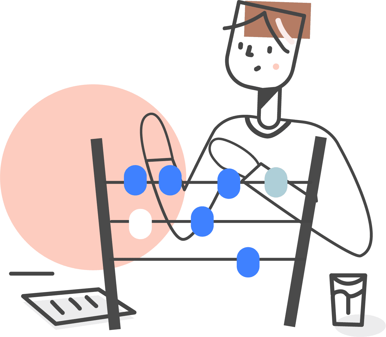
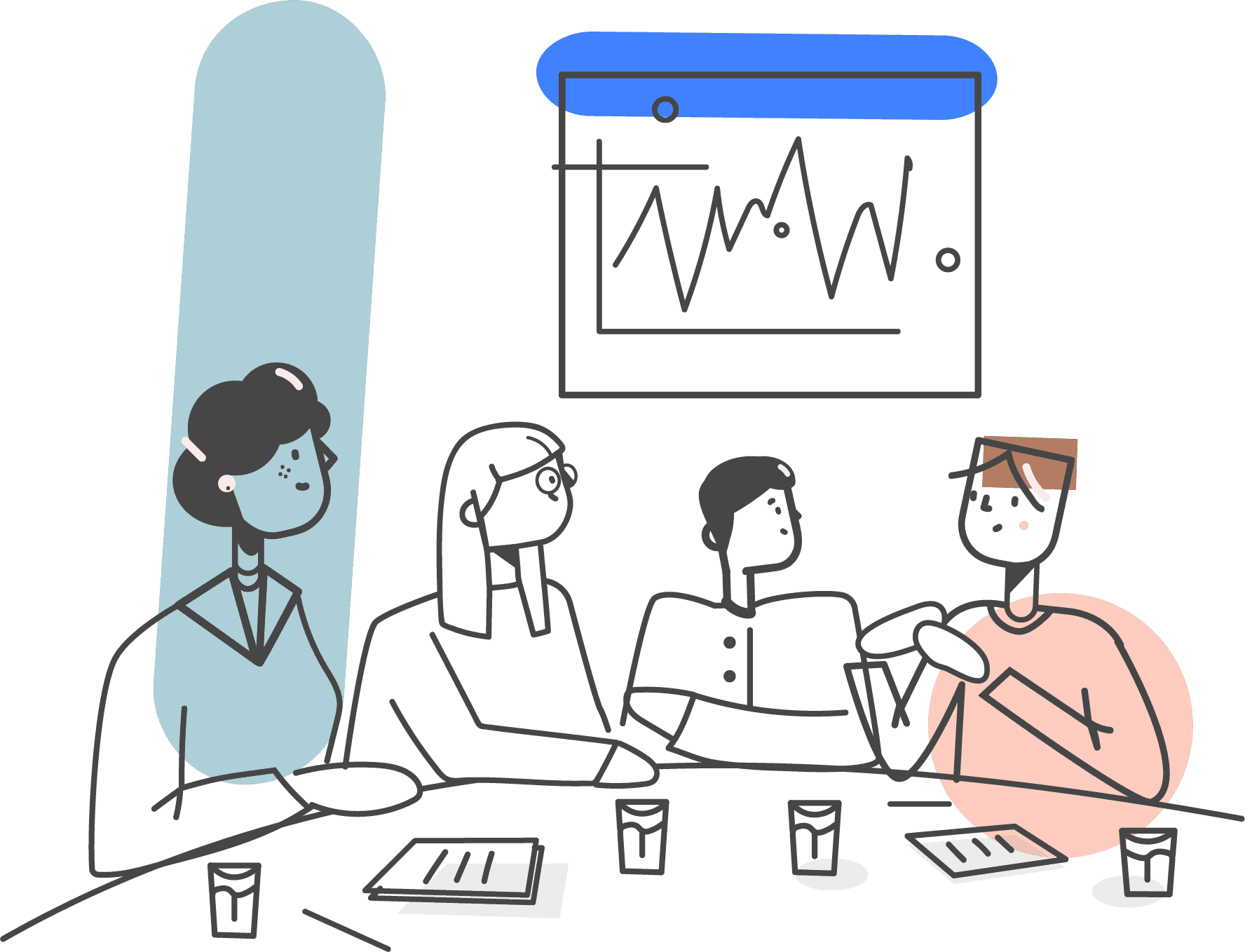
Established a visual language using smooth, friendly illustrations rather than generic stock imagery
Designed buttons, icons, and typography that felt approachable but confident
Focused on clarity and space, allowing the content to breathe
The goal was to make the website feel like the it's vision: grounded in well-being, yet modern and focused.

04/ The process
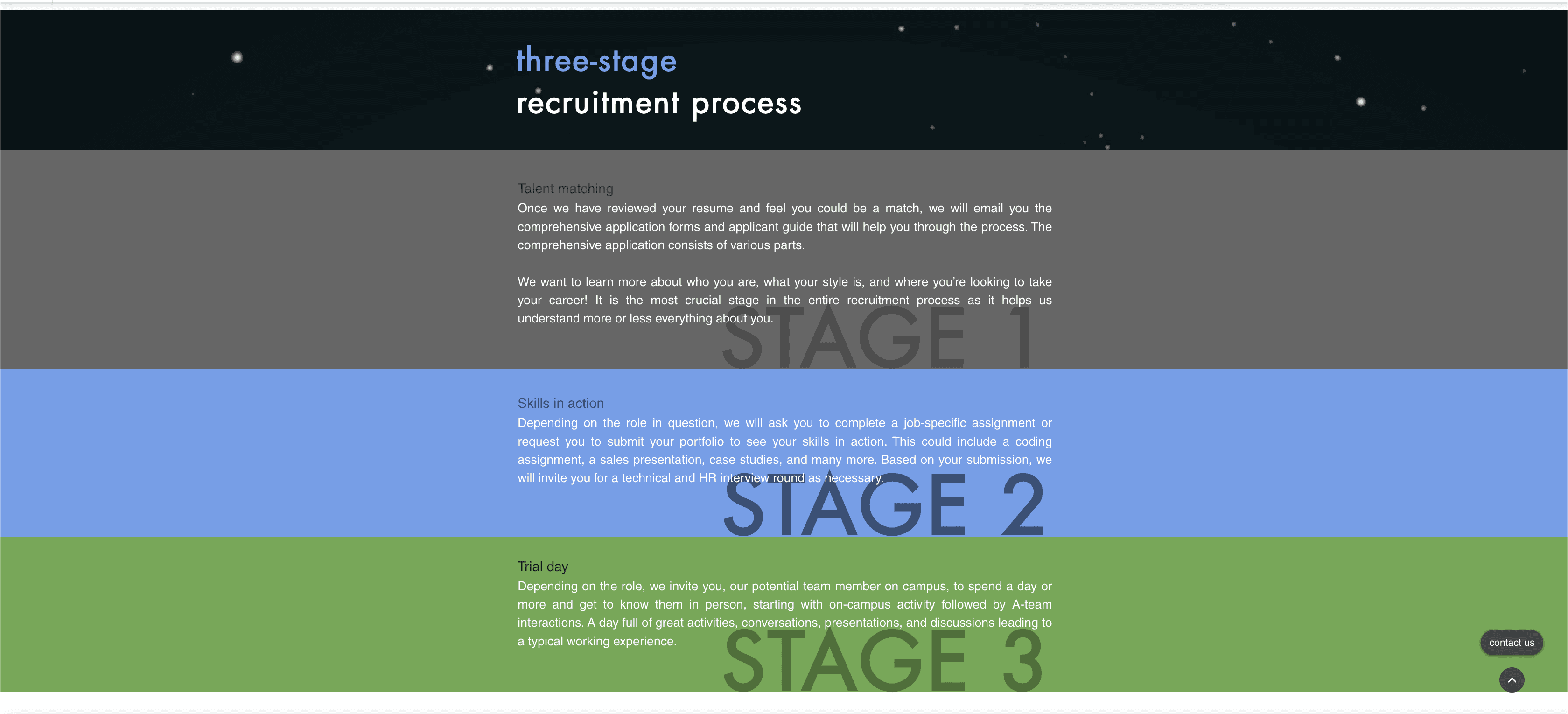
The existing site had pieces that worked individually, but it lacked a clear narrative and flow. It had animations sprinkled across the experience, but they weren’t always connected to meaning or flow. I wanted interactions to support understanding, not distract from it.
Removed animations that didn’t add value or clarity
Introduced micro-interactions where they supported the experience:
Cards that flip to reveal more context
Arrows that appear to guide the direction of flow
Subtle hover effects that make the interface feel responsive and alive
Used motion sparingly to keep the site feeling calm, not overwhelming

04/ The final version
The result was a website that felt more intentional: clean, guided, and quietly interactive—just enough to keep people engaged.
The redesigned Shoshin Tech website now:
Communicates the company’s focus on personal well-being and growth at a glance
Feels warm, minimal, and welcoming instead of generic
Tells a cohesive story about what the company is and how it works
Makes it easier for candidates to discover the company, understand it, and apply for any job openings that might interest them.
Has stronger visibility on Google, thanks to a considered approach to SEO
Most importantly, the site now acts as a true extension of the brand, not just a collection of pages.

fin.